
Build Your Home with the Home Depot –
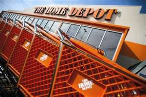
Arguably, America’s most favorite and the world’s largest home improvement store, The Home Depot was founded in 1978 by Bernie Marcus, Arthur Blank, Ron Brill and Pat Farrah. The first two stores were opened in metro Atlanta in 1979 and its first official headquarters was established in Georgia in the 90s after a strong performance which reeled in many customers.
Marcus and Blank, two of the founders, retired in 2000 and Robert Nardelli was appointed CEO of the company and was replaced thereafter by Frank Blake in 2003.
The company continued to grow strongly, and was ranked 17 on the Fortune 500 list in 2007 (which was a drop from its previous 14th). It was also in this year that the company sold its wholesale division, HD Supply to a consortium comprising of three firms, namely The Carlyle Group, Bain Capital and ‘Clayton, Dubilier and Rice’.
It also took a hit in 2009 and the years following it, since the global recession had an adverse affect on the home market and consequently The Home Depot’s sales. However, the firm remains a stronghold in the home improvement market, having spread its stores to Mexico, Canada and China in its short 34 years stay in the business.
The Home Depot Logo:
![]()
The Home Depot logo features an orange square with the company name imprinted on it in a large, bold white font. At first glance, the logo looks simplistic yet fairly attractive. Orange has often been a preferred color for construction companies and home improvement stores so HD (as it is called in short) has also kept that tradition alive. Furthermore, the use of orange is justified as it provides a good contrast to the white font. The orange could also have been used to represent success, determination and enthusiasm which are all positive factors which is why I feel it complements the Home Depot logo very nicely. It also complements the company slogan which says, “More saving. More doing”. The word ‘doing’ really catches your attention here as it goes well with the representation of enthusiasm and determination which the orange is meant to portray.
The white typeface is also suited to the company’s logo as it reminds you of disjointed building blocks which are pieced together to form the wordings. This immediately shows you what the company is all about, that is, they help you piece your house together to make it a home. The font is also large enough to be visible and since it is the main highlight of the logo the size is just about right to make the name of the company prominent but not too overbearing.
Home Depot’s April Fool Joke?
The 1st of April 2011 saw a popular website, ‘media bistro’ claim that The Home Depot had changed its logo by removing the word ‘The’ from the logo and using a lighter shade of orange for its background as well as using a solitary ‘H’ as the main focus of the logo.

The new logo on the right was later verified as a fake and it was eventually revealed that the whole thing was an April fool’s Joke. Admittedly it was not the funniest joke out there but it certainly did excite the Home Depot fans who actually liked the new look of the logo.
