Whatever your project is, presentation is and will always be the key to making a good impression on your viewers. Choosing the right font is crucial in getting the correct message across to the viewers. In this article I will discuss the effect of font color, size and style amongst other things that are required for different types of projects.
What is the Objective of your Project?
A popular analogy related to choosing the right font is that choosing the right font is like choosing what to wear. Therefore different types of projects demand different types of fonts. If you are making a business presentation, small, elegant typefaces will suffice – however when giving statistics or emphasizing on short phrases you could use a bold, large type fonts such as “Arial Black” to attract your viewers’ attention.
In contrast a gaming website might decide to splash around more color, use bigger, more stylish fonts like ‘Broadway’ or ‘Berlin Sans’ for their banners and headings, while using a slightly duller but still more energetic fonts for their normal writing.
Distinguishing between Serif and Sans Serif Fonts:
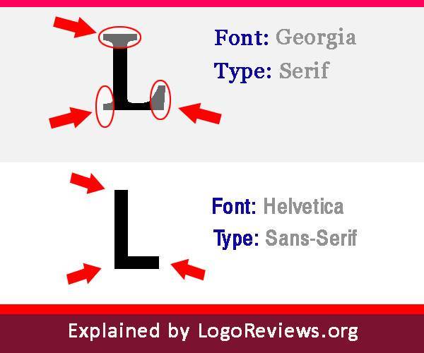
A better understanding of these two different types of fonts will give you a better idea of which font to use for your project. As you can see on the upper side of the photo, a serif font is characterized by small decorative flourishes such as the ones in the letter ‘L’ in this case. Sans serif on the other hand does not have any changes in stroke. Sans is a French word that means ‘without’. So Sans-Serif means without serif, it is pretty much self-explanatory there.
Scientifically speaking, serif fonts are better utilized on print rather than in soft copies. Sans serifs on the other hand are better used on websites or in word documents for example.
This is because printed works such as newspapers or books generally have a resolution of a 1000 dots per inch. It means that a serif font is easily recognized by the human brain in bigger and better resolution. Serif fonts in computer screens would look cluttered and jumbled because of a lower resolution of about 100 dots per inch, therefore option for a sans serif font is better in web scenario.
Understand the Color Psychology:
This is more helpful when selecting the right color for a banner, heading or an advert. Different colors can induce different emotions in your audience or give different signals. Therefore, you should make sure you choose the right color in order to get the desired message across to the audience.
However it is also important to understand that one color may hold different meanings for different people. This is usually related to your culture, personal feelings or background. For example, the color white is a symbol of purity in Western culture; however it symbolizes mourning in the east.
Colors should also be used to target a certain age group. Children are more attracted to bright and bold pastel colors; therefore a banner for a games website would attract the targeted audience with mixtures of bold colors like orange, red or even silver.
A presentation in a business setting would be more likely to use elegant, subtle colors like blue in its various shades, black and if you would want to be a bit more daring a splash of purple.
Usually bright, bold colors like red, yellow, orange and pink are used to get the crowd energized and attracted. They could also be used to emphasize some point, though this is not usually applicable to business presentations. However, as I mentioned before, different cultures may interpret colors differently. For example, in America, red would normally portray passion, violence or anger – in other words, generally excitable emotions. In Africa, the same color is the color of mourning so using colors depends mainly on your audience.
When in doubt, use this flow chart:
If you are still confused about which font to select for your project, you could use Julian Hansen’s innovative flow chart to help you out! Just go along the chart by answering the questions and you will end up at the font that should be most suitable for your project.
This project by Julian Hansen, who is a graphic design student at the Danish School of Media and Journalism is called, “so you need a typeface” and has a combination of around 50 results that you could end up with.
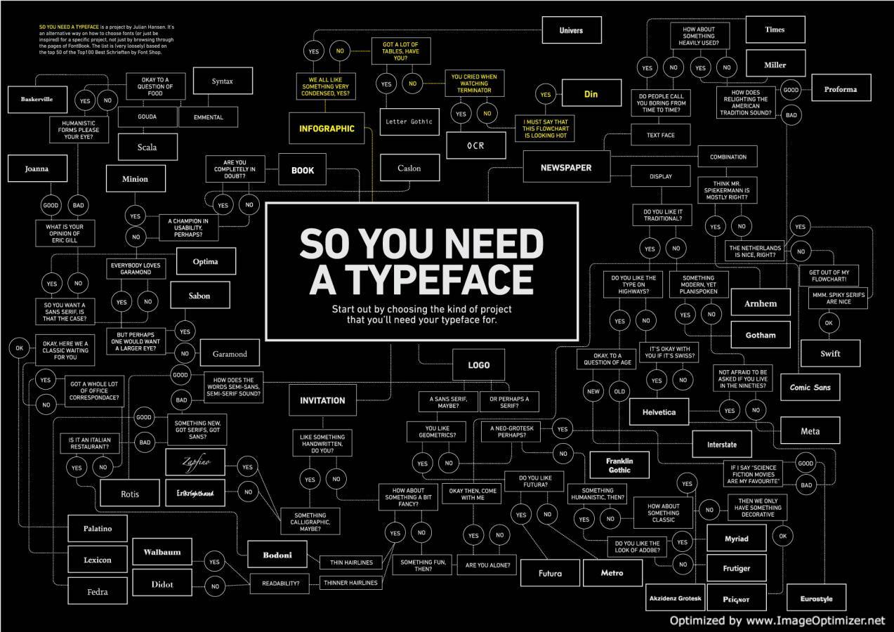 Image Credit: http://inspirationlab.files.wordpress.com/2010/04/din.jpg
