A Journey through Nintendo’s past:
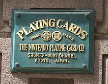
One of the largest video games company in Japan and also revered around the world as a top video games producer, Nintendo’s origins were based on a different type of game. It was founded by Fusajiro Yamauchi in 1889 as a card company which produced a card game called Hanafuda.
In 1963, the company was renamed from Nintendo Playing Card Company to just Nintendo Co., Ltd. The company began to venture into different avenues including a taxi company, TV network as well as a food company! These ventures did not last long however and the company found itself struggling in the Japanese toy market before finally making a place for itself in what was then the arcade games industry.
In 1974, Nintendo stepped into the video game industry by securing rights to distribute Magnavox Odyssey video gaming console in Japan. The company simultaneously worked on producing its own video games and enjoyed a rising success in the industry. The popular game boy, a hand held gaming console was developed in 1989 and became the best selling hand-held of all time.
The company faced stiff competition from competitors like Sega and Sony but introduced a range of new gaming products on a regular level to stay in line at the top such as the Nintendo DS and Wii. However, it has arguably lessened in stature over the years with many of its products failing to hit the standards set by competing firms.
The Nintendo Logo History:
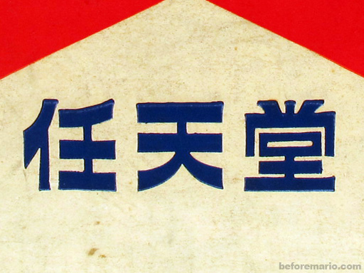
The three Japanese symbols above spell Nintendo and were used on the company products and still are printed on many of them to this day and age.
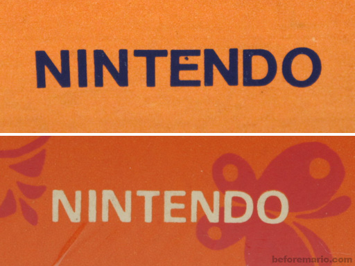
The company has had many logos over the years; many of them were exclusive to a single product. Nintendo changed its logo very frequently over the course of its history from a tacky flowered print to a circular red logo and so on.
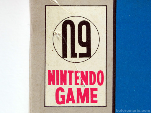
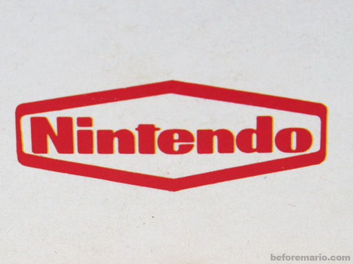
The Nintendo logo today:
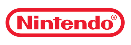
Popularly known as the ‘race track’ logo, this emblem has been at the company’s helm for quite some time now. It is fairly simple featuring the company’s name and encircled in an oblong shape, both colored in red and set against a white background.
This has been Nintendo’s logo ever since it ventured into the video games industry and has stayed the same since which is a tribute to its long-standing efforts to stay at the very top. It also shows the company’s popularity since such a simple logo is recognized and admired by fans worldwide and has been the face of the company for around four decades!
The bold, clear-cut typeface of the logo makes the company name very prominent and whenever you look at it, you immediately think back to popular Nintendo products like the Game Boy or their laser guns.
The red color is also a great design feature of their logo as it is very appealing and eye-catching. Furthermore, the color shows the company’s passion, energy and vigor which all great traits to have for a long-serving company such as Nintendo. The red color also fits in well in an aesthetic sense with the white background which provides a subtle contrast which makes the logo look very lively and vibrant, especially on the products and on paper.
The ‘race track’ as the circular shape is known, was probably used for designing purposes only but it might also have been used to show the company’s speedy success to the top. Apart from that, a race track also represents the classic car racing video games which are one of the most popular in the gaming industry, therefore the race track symbol could have been used to show the company’s relation to video games as well.
