“Some Things are Priceless – for everything Else there’s MasterCard”
This catchy slogan has become universally recognizable due to its constant repetition on social media as well as other advertisements of the famous MasterCard debit and credit cards.
MasterCard Worldwide can trace its origins to the Interbank Card Association (ICA) which was formed by a group of banks from California. This association created the ‘Master Charge’ in 1969 which gained popularity across the country and became famous overseas as well.
In 1979, the card was renamed to ‘MasterCard’ and operated under ‘MasterCard International’. In the 1990s the company bought the ‘British Access Card’ and then merged with ‘Europay International SA’ in 2002.
In 2006, the company changed its name to ‘MasterCard Worldwide’ and also adopted a new tagline which was, ‘The heart of commerce’. In 2010, the company acquired ‘DataCash’, a UK company dealing in payment processing and fraud management. 2 years later, the company announced that it would be expanding its services of mobile payments program all around the globe especially in the Middle East where it planned to foray a few years before.
Evolution of the MasterCard logo:
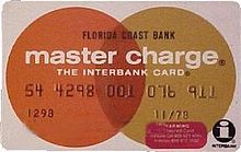
While its name was still ‘master charge’ the following logo was used for the company as well as their credit cards. It featured two intersecting circles of an orange and dark yellow shade with a dark red in between. Apart from the company name, the words, ‘the interbank card’ and the interbank ‘I’ was used on the logo.
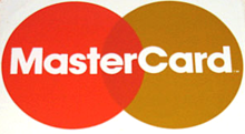
The logo was changed in 1979 and now read ‘MasterCard’ and lacked the ‘I’ and the ‘The Interbank Card’ of its predecessor. The logo was much simpler and more attractive though it largely remained the same barring the removal and modification of the wordings.
The next logo in line was designed in 1990 and featured lighter shades. The orange was now turned to a red while the yellow was much lighter than that in the old logo. The logo also featured horizontal bars in the intersection of the two circles.
The final redesign so far came in 1997 and is still used on all MasterCards. The logo showed a change to a more darker shade again and less horizontal bars in the middle. This made the logo look much more simple and effective.
The logo resembles a venn diagram, perhaps because it is meant to show the intersection and harmony of the two colors red and yellow. The red represents the company’s vitality and passion while the yellow portrays a sense of vigor, happiness and prosperity. The reduction in the number of horizontal bars also makes the card look more attractive. The font of the MasterCard logo is a custom typeface and has been derived from the ‘Frutiger Bold Italic’ logo.

2010 saw another logo design make its way into the MasterCard world. This logo was not used on cards however and was only designed for a corporate rebranding. It features a bunch of cirlces intersecting between each other possibly to show the harmony between different customers and countries that the MasterCard serves. The logo also features a bunch of hues and different shades of red and yellow which make it look more intriguing, innovative and attractive.
The bold font that says ‘MasterCard Worldwide’ at the bottom shows the consumer that MasterCard reach is global which is an important marketing strategy for the company in terms of building and capitalizing on its reputation and popularity.

