One for the Gamers – Kotaku
One of the hottest video games blog at present, Kotaku is part of the Gawker’s Media network of websites, which also include popular blogs such as Gizmodo and Jezebel. Created in August 2007, Kotaku is now a popular destination for avid gamers as well as new gamers looking to search for reviews on the latest games. With monthly visits exceeding 12 million for this blog, it is evident that it is one of the more popular blogs around and exceeds its counterparts such as LifeHacker and Deadspin in terms of unique visits as well as visits per month. Japanese and Brazilian versions of this blog have also been created in July 2009 and November 2010 respectively.
The blog is currently headed by Stephen Totilo who is the Editor-in-Chief of Kotaku while their list of alumni contains many respected faces in the video games industry including IGN.com’s Jim Riley and Wired.com’s John Brownlee.
The Kotaku Logo
 Many people have come to expect a funky, wild logo from gaming blogs and websites. In this respect Kotaku is no different. Written in a mild yellow text often on a strip of purple though this is not always the case, its logo makes use of a fun looking font with an inverted comma at the end. In other cases, the whole logo is not used and a single ‘K’ is used to represent the blog. This letter also uses a mild yellow color which often looks to be edging towards a greener shade. Since the letter has a 3D effect in the logo, the undersides of the ‘K’ are colored in bright purple giving a vibrant and bold look, which goes hand in hand with their blog’s theme.
The Kotaku logo is a symbol for a large fan following:
Kotaku has simply risen in popularity since its inception in late 2007 and its logo is recognized by millions of gamers worldwide. If we shed light on some statistics, the readers will be able to see how popular this blog actually is. Their average visit per person is 3.42/person whereas that of all other blogs comes to 3.07.
The website also has a Google page rank of 7 which is a testament to its popularity on the internet. The website also receives around three and a half million unique visitors each month!
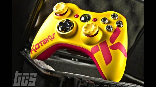
Lately, the Kotaku logo has been increasingly used on merchandise such as T-shirts and mugs, but more importantly it is used on extensive gaming gear. Only recently in May, ‘ The controller shop’ made a customized Kotaku Xbox 360 gaming pad, another evidence of the blog’s rise to fame in recent times. Behind every successful business (or in this case blog), of course is the company’s logo and the story is no different here.
The blog’s logo is an identity that is not unrecognized in the video games world but furthermore it has also been noticed by blog raters and viewers online. Currently, this blog ranks in the top 40 of Technorati’s blog list.
Some other interesting facts about Kotaku
As is expected of all gaming blogs the majority of the viewership is dominated by males, in this case 80%. The demographic structure though, is more interesting with 53% of the viewers being between the ages of 18 and 34, while 22% are above the ages of 35.
Kotaku also publishes a series of comics on Sunday for its viewers which are their picks of the best comics on the web.

