 An icon for New Yorkers and people from all around the world, the logo that triggered a domino “I (heart) something” effect.
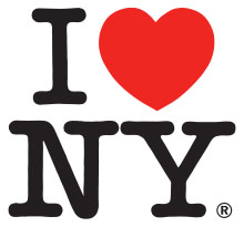
History of the I Love N.Y. Logo
The ”I Love NY” logo was designed in mid- 1970s by Milton Glaser for a campaign to advertise tourism in the New York City. He only thought it will last for a few months and didn’t even ask for rights to the logo, didn’t make it a trademark. It’s too bad because now it’s one of the most famous logos in the world. After its big success it became the advertising logo for the New York State also.
![]() The “I Love NY” logo originally was written on only one line, not two like it is now, but after it was changed the font and the basic design remained the same.
The “I Love NY” logo originally was written on only one line, not two like it is now, but after it was changed the font and the basic design remained the same.
Design of the I Love N.Y. Logo
The charm of this logo is the simplicity of it; the simple straight lines, with rounded edges fit perfect with the only 3 letters that it contains. The simple and full red heart that follows the “I” fit’s perfect with the simplicity of the letters. And after putting the “I heart” on one line and the “NY” on the line beneath, you have one of the most iconic logos in the world.
Glaser used the slab serif typeface font named American Typewriter to write this, very patriot font for such a patriot logo. Simple fonts like the one Glaser picked are perfect, because it’s the kind of font that is simple to read at any scale, it’s easy to remember something written like this and clearly you can’t go wrong with it.
The I love NY logo sends a very clear message out in the world and it’s very easy for it’s image to stay in people’s minds. It does its job as a logo because even when you don’t see it and you only see the red full heart somewhere random it still reminds you about the “I Love New York” logo.
The charm of it is that it’s not only an image as every other logo, it’s not something you have to figure out what it means or represents, it’s not a normal logo with an image that represents the idea of the message or some kind of image that relates to the name of the firm. The beauty and simplicity of it is that the logo’s image, the heart, a very strong symbol, makes the logo itself and at the same time is or represents the idea, a word and a very clear and strong message.
It’s an international message, everybody knows what it is, and it’s simple and clear, charming and romantic and catchy at the same time.
The sure thing is that Glaser got it all right, in every way.
It’s not going to fade, it’s not going to stop being great, it’s not going to stop being used on t-shirts, mugs, license plates and everything else it’s put on, it’s not going to stop being copied and all the other logos in this world that “love something” are not going to stop looking like this one.