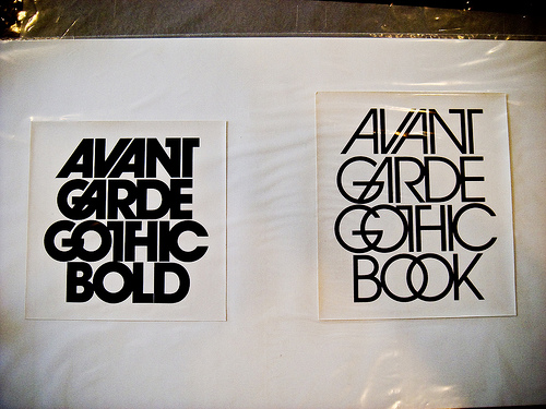
‘Coming to terms with Lubalin’s work takes you quickly to the heart of a very big subject: the theory of meaning and how meaning is communicated – how an idea is moved – full and resonant, from one mind to another. Not many have been able to do that better than Lubalin.’ (AIGA 1980)
Herb Lubalin – Typographics Designer

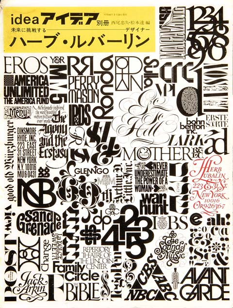
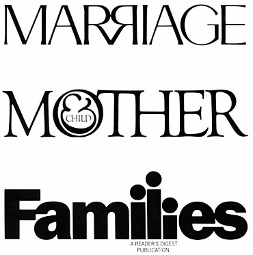
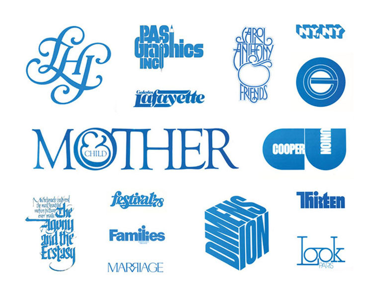
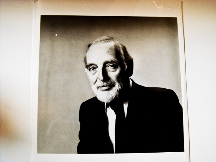 Many people described the work he did as typography but he always insisted that typography was not what he did but typographics, believing that the former was about the mechanics of putting letters together. His understanding of it was actual designing using letters.
Born in New York in 1918, he was to become a prominent American graphic designer. When at high school, Lubalin showed no inclination toward a graphics career other than for repeated pictures of erotic drawings of Tarzan and Jane, which got him a reputation as a dirty young man. When he left high school, he entered the Cooper Union after scoring 64th out of an acceptable 64 on the entrance examination. Prior to his graduation in 1939, he recklessly entered the McCandlish outdoor poster competition for students and professionals, and walked off with the 2nd prize of $50—no small sum in those days. Pleased with this honour, having filled his first “0″ with a Hires Root Beer Cap in the slogan “It’s Tops”, he made the decision to spend the rest of his life pursuing an “O”-filling (among other letters) career.
After graduation from The Cooper Union, Lubalin claimed to have done nothing significant in the graphics world until 13 years later when, in 1952, he won his first New York Art Directors Club Gold Medal as creative director of Sudler & Hennessey and a partner in its design organization, SH&L.
Herb Lubalin, Inc.
In 1964, he formed his design consultant firm (“inspirationally named Herb Lubalin, Inc.”), which evolved into what he called the first international graphics cartel. Five years later this grew to LSC, Inc., including the talents of Ernie Smith, Tom Carnase, and Roger Ferriter. A year later, several subsidiaries were added: Lubalin, Delpire & Cie, Paris, Lubalin, Maxwell Ltd., London, Good Book Inc. (“a highly unsuccessful publishing venture”), and Lubalin, Burns & Co., with its successful typographic offspring, International Typeface Corporation. In 1975, the logo was changed to LSC&P Design Group, incorporating the talents of Alan Peckolick.
During this reorganization, he also had time for some creative work. Among his major contributions to graphics were his designs for Eros, Fact, and Avant Garde magazines (all defunct), two redesign attempts for the Saturday Evening Post (also defunct), Air Mail stamps, along with a new 13¢ one, for the U.S. Post Office, a poster for the American Exhibition in Moscow, and a few articles for the USIA publication, Amerika.
Herb Lubalin, Famous Graphic Designer, Typography Expert
He has been the subject and author of many articles on graphic design, which have appeared nationally and internationally in, among others, such leading publications as: Art Direction, American Artist, Popular Photography, Communication Arts, Graphics Today, Graphis, Idea, and Gabrauchsgraphik.
In tribute, Print Magazine included him in its special 1969 issue, “Great Graphic Designers of the 20th Century.”
Very much in demand on the lecture circuit, Lubalin imparted “little information with great flair and erudition” to schools and professional organizations from the United States to Europe, Canada, South America and Japan. He was a visiting professor of art at The Cooper Union and taught at Cornell and Syracuse Universities, as well as serving on the Advisory boards of Kean and Hampshire Colleges. The professional organizations with which he was involved were legion. Among them: the Art Directors Club, AGI (International Vice President), and AlGA, where he was a member of the board.
Herb Lubalin’s awards included seven Gold Medals from the Art Directors Club, Art Director of the Year Award from the National Society of Art Directors, a Clio, two honours from The Cooper Union, the Augustus St. Gauden’s Medal and The Award for Professional Achievement. He considered, however, his greatest achievements were his sons: Robert, a talented designer with the architectural firm, Davis, Brody, and Peter, who came to advertising prominence with his Dannon Yogurt “Russian” commercials.
Herb Lubalin Typeface Inspiration
He died in New York in 1981.

