
Buy and Sell online with ease at eBay:
eBay is a website where people can buy and sell various consumer goods online. The website was started by Pierre Omidyar who had previously been working to develop software for Apple Computers. The website was established in September 1995 in San Jose, California and soon became one of the most visited and arguably the most popular retail websites in the world.
Originally called Auction Web, the name was officially changed to ‘ebay’ and the domain name registered as www.ebay.com in September 1997. With the help of Meg Whitman from Harvard Business School in 1998, eBay procured a management staff and soon found success that could not be match by any online retail site of the time. It then went public in 1998.
The website acquired online payment service, PayPal in 2002 which became the site’s preferred payment option. It also bought Skype in 2005 but sold the majority of its share in 2009 retaining only a minority investment in the company.
Just a decade and a half since it was established, eBay has become one of the most popular websites in the world. By the end of 2011, it had more than 27,000 employees and was earning revenues in the range of 11 billion dollars annually!
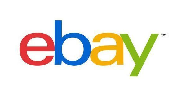
Overview of the eBay logo:
![]()
The eBay logo was designed by Bill Cleary who worked for CSK, a designing agency in California. While the logo might read ‘ebaY’, the abrupt capitalization of letters is done purely for designing purposes and the company name is actually written as ‘eBay’. The designer felt that a capitalized ‘B’ in the middle of the logo was too jarring and proved to be a ‘road block’ in the middle of the design and as a result the letter ‘Y’ was capitalized.
The logo features the company name with each alphabet colored in different colors – 4 classic colors, the primary colors and green are painted on the words. The letters are placed on different heights – this is known as a ‘baseline shift’ in designing terminology and improves the vibrancy and overall design of the logo. The way the logo is set also represents the overall appeal of the website and is perfect for a website whose vision is ‘to connect people’ rather than to sell them stuff.
The colors show passion, excitement and lots of energy as well as a sense of enthusiasm, something which really attracts consumers. The logo therefore, deserves a lot of credit for making the company so popular around the world. This emblem has become universally recognizable just for its simplistic yet contemporary design and its popularity has been enhanced by the fact that it contains the company’s name therefore it is not mistaken with any other institution.
A new eBay Logo?
For the first time since 1995, the company introduced a new logo, something that all eBay fans were itching to see. It was released just a week or so ago and is expected to make its debut in October 2012.

The most obvious change is the fact that the font is much simpler and skinnier and the words do not float around. There are no more capitalizations as well. The words are now connected but do not overlap like their predecessor which is explained by company president, Devin Wenig in the following words:
“Our vibrant eBay colors and touching letters represent our connected and diverse eBay community”
While eBay was majorly an auction site in the past, it has grown and evolved to an extent where most items sold on the website have fixed prices and are not auctioned anymore. Therefore, it made sense for a rebranding to take place to show the change in the company.
The new logo also looks more professional and it is a good change since eBay is now more of a retail site than anything else and needs to show a level of professionalism to gain trust of the average individual. It has however, retained its old colors to make use of its well established goodwill around the world as well as to link it to its roots while moving forward in ever-changing times.