The Origins of BMW:
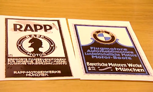
Fully known as the Bavarian Motor Works (when translated to English), BMW was formerly known as Rapp Motorenwerke which was an aircraft manufacturing company. It was restructured and renamed to BMW in 1917. However after Germany was forced to sign the ‘Versailles Armistice’ Treaty at the end of World War 1, aircraft manufacturing was forced to halt so the company began to manufacture motorbikes in 1923, followed by automobiles in 1928.
Aircraft engine manufacturing was resumed in the 1930s and many German planes used in World War 2 had BMW engines. However, in 1959 the company’s automotive division was in severe financial difficulties so much so that liquidation was being considered. The company decided against it though and they got back on their feet soon after, acquiring a German automobile company called Hans Glas in 1966.
BMW moved into a new headquarters just in time for the 1972 Olympics. The headquarters is situated near the Olympic Park and was shaped like 4 cylinders to emphasize on the connection with automobiles and the company logo.
Amongst other acquisitions such as Designworks USA and the British Rover Group (which was later sold), the company is also parent to the Rolls-Royce manufacturing brand. In June 2012, BMW was ranked 1st as the most reputable company on Forbes.com
BMW logos throughout the years:
When Rapp grew into BMW the company wanted to preserve its history and therefore designed the logo that we see today.
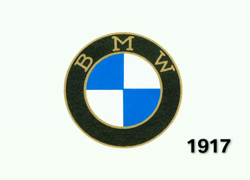
This was the first company logo and as is pretty evident, the ‘BMW’ on the top is inscribed in the same style that ‘RAPP’ was on its logo. Thus BMW made its own identity while retaining its history. The logo mainly consists of two circles with ‘BMW’ inscribed in the larger one while 4 equally sized quarters colored alternately with blue and white. The circles were lined with gold in the original logo but this changed to silver later on. The first logo was made and registered in the 1917 and is surrounded by a lot of myth which will be discussed later on.
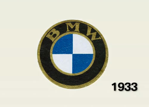
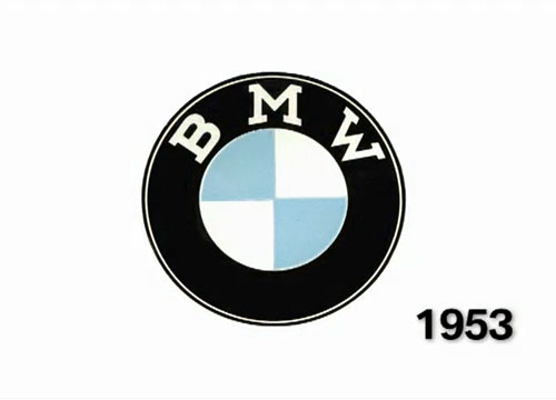
1953 saw a shift away from the golden lining on the circles and established a more clean-cut and classy look.
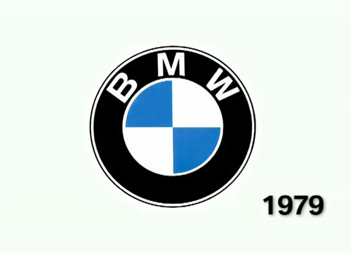
A more refined version that its predecessor, the 1979 logo had darker outlines while the blue quarters did not touch each other which brought out more of the white in the logo, perhaps to offset the black circles.
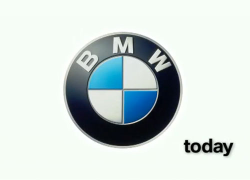
The latest BMW logo has a sporty design that has metallic finish making it suitable for the high grade of cars that the company produces. The matte finesse also looks good on the metallic body of the car while the ‘BMW’ engraved on the top in sort of a 3D effect also seems to pop out of the logo when seen on a car giving it that extra edge that many modern logos seem to lack.
The change of the circle linings to silver is also distinct in this logo and personally I feel that silver goes much better with the black than the white as it looks more classy and upscale. The 4 quarters in the logo are also of a much darker shade which goes well with the new logo which is also much darker and sleek than the previous one. Once again, while this might not look much on paper (or print), the darker shades look amazing on the car itself and shine more brightly in light while the matte finesse on the logo gives it a cutting edge finish. The logo is now popularly referred to as ‘Roundel’.
Myths behind the BMW logo:
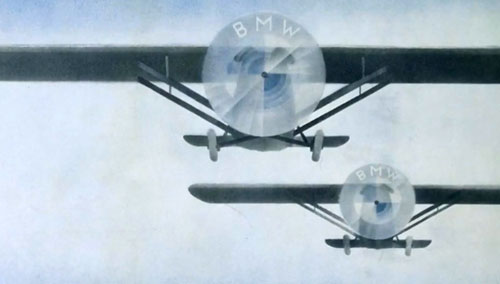
There are two popular myths pertaining to the origin of the BMW logo. The first one says that the logo represents white propeller blades against a blue sky, which is in connection to BMW’s aircraft production. The circular design is said to show the movement of a circular propeller blade of an aircraft. This myth was inspired by a company magazine in 1929 which had the following picture as its cover.
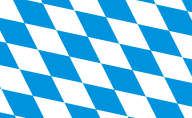
The second myth says that the blue and white represent the Bavarian national colors. The Bavarian flag is designed on a background of white and blue checks.
Of course some people believe that the BMW logo is a combination of the two.
Kai Jacobsen, an automobile historian of the BMW group had just this to say:
“As Rapp grew into BMW, BMW assumed all the business segments, and the company wanted the logo to be oriented on Rapp’s logo. As you can see here on this example, Rapp has a black horse as a symbol on its logo. BMW chose the Bavarian national colors as a symbol, but arranged the letters exactly like Rapp. So you can see very clearly how the BMW logo was developed.”

