Audi AG is the world’s famous automaker in Germany. The company deals in luxury motorcycle and cars. In 1909, August Horsh founded the company. The name “Audi” was driven by “Horsh” which means listen. Listen when translated in Latin becomes “Audi”. The company has been leading the automotive sector with technical development for more than a century. The company employs 46,372 people all around the world, with total asset of €16.832 billion as of 2009.
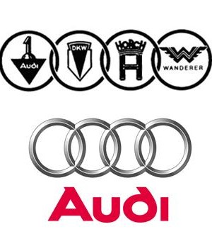
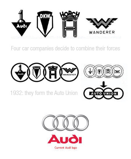
Audi cars are famous for its outstanding interior with spectacular performance. They are known for safety, comfort, and sophistication in line with rallying capabilities and high-speed performance. The logo review of Audi comprises of reminiscent of the four auto makers which merged together at the time of creation of the company. Recently, in 2009, the logo was changed to celebrate 100th Birthday of Audi. The company’s slogan is Vorsprung durch Technik which means “Advancement through Technology”. The slogan has its own importance in logo display as it adds value to the graphical representation.
Shape of the Audi Logo
The Audi logo consists of four striking sharp 3D overlapping rings which appears with a defined chrome finish. The logo is representation of protection and power, which shows the Audi merger with three famous automakers in 1932. The overlapping rings depict the strength of the bonds with their customers and signifying unity of mergers. Logo is Audi is a true example of company doing untiring effort to increase efficiency, loyalty, and excellence.
Colors of the Audi Logo
The Audi logo having chrome color is very modern and classy. It is bright and slick which gives it a sophisticated touch.
Font of the Audi Logo
San-serif font has been used in Audi logo which depicts simplicity as well as style.
The new Audi logo is still progressive and modern and makes the core of the brand to its key message: Vorsprung durch Technik. The new logo is the first time the brand essence combined with the brand, the four rings. Unlike the old logo, the new logo looks much more realistic and that is exactly the point at which one had to go zoom. The new logo should look like as if someone took a picture of it.

The old logo has far less reality, but rather a little artificial. The colors look rather less and are also much better. The gloss is not so much to the fore. Furthermore, the typos in the old logo have been given much greater prominence. But the Audi logo has anyway already had to go through several revisions. With the merger, there was also a new logo for the first time included the famous four rings. In this first version, however, there were still the respective logo examples of the four merged companies in the rings. It was from then until today several new formations of the company, gave the Audi logo is used today for the first time with the renaming of the company to “Audi AG”, in 1985.


