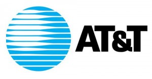
AT&T Inc. is a world famous US telecommunication leader. It is said to be the biggest companies with its headquarters in Dallas, Texas. Besides that, it is one of the largest mobile network operators in the whole world. According to logo designer reviews, the three dimensional blue logo looks trendy with arches as it symbolizes that the world is surrounded by electronic communication. The purpose of choosing this logo out of various logo ideas was to give impression of shadow and light. The shadow and light represents the depth of services and expansion in scope offered by the AT&T new family, its global presence, and its customers.
Design Elements, History and Evolution of AT&T Logo
Shape and Colors of the AT&T Logo
Saul Bass being the sole creator of the AT&T logo, he is officially credited for designing the most memorable logo in graphic design history. The logo became influential in creating a strong brand presence and served its purpose well. It later on became the choice of many customers, and however, the changes were brought after merger with SBC. The symbol soon started looking worn and aged, which affected the company’s financial performance. As a result, to cover up the deficit a new design was introduced. Blue being the primary color for the logo was kept intact, and with the help of Interbrand a modern touch was wisely incorporated in old globe by lending dimension.
To increase the symbol’s attractiveness and approachability, the horizontal wires wrapping the globe were modified. These wires carry luminosity and transparency which is crucial for enhancing brand identity. SBC and AT&T are highly associated with blue color so the blue base was used in new logo. The new logo of AT&T was designed to tell the people that the company is leading in offering best service for businesses and consumers in the industry.
Font of the AT&T Logo
The overhaul is also noted for a considerable change in the font selection of the wordmark. Influenced by Avenir, which was the corporate typeface of Cingular Wireless LLC, a custom lowercase font was developed. Moreover, the solid monolithic font in the old AT&T logo was carefully reworked and in its place a softer and dynamic lowercase type was introduced.
Font selection for the wordmark was among the major changes witnessed in the course of designing logo. Corporate typeface of Cingular Wireless LLC influenced by Avenir was the font used in lowercase. The solid monolithic font in the old AT&T logo was modified in favor of softer and dynamic lowercase type.
