A Brief Atari History:
Atari is one of those godly symbols for all avid video game players, especially those from the 70s and 80s who still fondly look back at one of the most popular gaming consoles of their time.
The company was found in 1972 by Nolan Bushnell and Ted Dabney and entered the gaming industry as the largest arcade games producer. It started out by introducing the popular 70s arcade game called ‘Pong’ and in 1977 released its first console called the Atari VCS which was the first console in the computer entertainment industry. It also manufactured personal computer systems, most of which were 8 bit systems but one of the best technologies of the time.
In 1984, the firm was renamed to Atari Corporation probably due to their foray into the computer market where they started to produce 16 and 32 bit systems. More importantly however, the company split up in 1984 with its computing and arcade gaming divisions going their separate ways. The latter was then bought by many other companies including Hasbro and is now part of a French publishing company called Infogrames who were renamed to Atari.
Responsible for many classic games such as Pac-Man and Space Invaders, Atari will be forever remembered in fondness by all video gamers of the 20th century.
The Atari Logo:

The original Atari logo was George Opperman, who was also the company’s first in-house graphic designer. The logo evolved over the years to become the one that you can see in the picture above. It features a sign that resembles an ‘A’ with the company name written in a casual font at the bottom in white and a red background to top it off.
The design of the ‘A’ is the most intriguing part of the logo as it is more than just an artistic design of the alphabet which starts the company name.
The logo is popularly known as ‘the Fuji’ due to its uncanny resemblance to the Fuji Mountain in Japan. Another link that it has with Japan is that the term ‘Atari’ is used in a Japanese board game called Go.
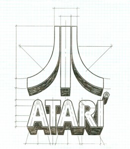
However, the designer George Opperman designed the logo with an entirely different inspiration. His vision was to not only depict an ‘A’ but to also base it around the popular ‘Pong’ game that was Atari’s first success in the video game industry. Therefore, his design is a modified depiction of the court in the Pong game. In a statement, George was quoted as saying that, ”the two side pieces of the Atari symbol represent two opposing video game players, with the center line of the ‘Pong’ court in the middle.”

George’s 1972 sketch above shows exactly what he meant. Today, the Atari logo may be a bit obsolete due to the domination of other firms in the gaming and computing industry. Nevertheless, it is more than just a sign of the past for all gamers who remember the age of arcade games. Like all good logos, Atari’s logo is also based on an inspiration, in this case, its successful game ‘Pong’.
The red and white color combination is also very appealing and contemporary while the design is relatively simple and definitely unique. Its typeface conveys a friendly and casual tone which is a real boost to its computing and gaming side.
The design of the ‘A’ has become a symbol that is recognized by gamers worldwide whether or not they were fortunate enough to try an Atari. This is a testament to Atari’s success over the years and it is an admirable fact that they’re still powering through despite being overshadowed by so many firms in their industry. Thus, in a way, the Atari logo is also a conveyer of hope and a reminder of the good old 70s!
Atari’s logo variations:
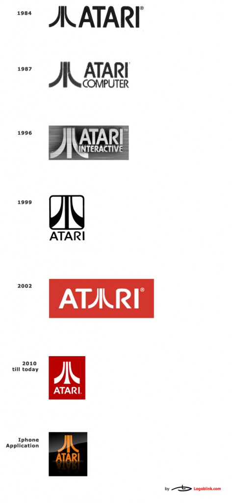
The company changed its logo many times over the years and also had variations for its computing machines and different arcade games. Here, we look at the history of the company logo throughout the years.

Then came the logo that we know and love today:


