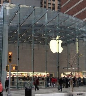
Apple – Revolutionizing the World of Technology:
Everyone recognizes Apple for its breakthrough technologies in mobile and computer markets. The company first took shape in 1976 when Steve Jobs and Steve Wozniak got together to create an inexpensive computer which they called the Apple I. Computer Engineer, Steve Wozniak is credited with the main designing of the computer.
Wozniak then set out to improve on his first creation adding basic features to his computer to make it feasible for the average Joe. The result was Apple II which was released on the 5th of June 1977. The computer became very popular and this seemed to kick start the Apple corporation which had been formed on January 3, earlier that year.
Apple soon released its first printer called SilenType and proceeded to grow, going public in 1980 and raising more capital than any IPO since Ford. Apple created its landmark advertisement for the Mac in 1984 which was played after the Super Bowl and is hailed as one of the best PR decisions Apple has made.
However, just one year later, Steve Jobs quit the company due to infighting and created his own company called NeXt. 10 years later in 1996, Apple bought NeXt bringing Jobs back to the company where he became interim CEO in 2000.
2001 saw Apple introduce the iPod which was an instant hit with over 300 million iPods sold since its debut. The iPhone was then launched in 2007 which again gained massive success over a short period of time. Apple’s famous Apps store made it possible for users to do an astounding variety of tasks with their phones.
Just 3 years later, the company launched another exciting product, the iPad, a powerful tablet computer. In January 2011, Steve Jobs announced that he was taking an indefinite leave of absence to focus on his health. In June of the same year, he launched the iCloud, a syncing device which would be his last launch before his death a few months later. Apple continued to foray into the different markets launching revolutionary products like the iPhone 4S. On August 2012, Apple’s company stock rose to 624 billion dollars – The highest ever in the world!
Apple Logos throughout the Years:
A company with such a rich history needs a well defined logo to serve as the face of the company. Apple has had 3. The original logo was inspired by Isaac Newton who is featured in the logo, sitting under an apple tree. The words ‘Apple Computer Co.’ were printed on the ribbons protruding from the picture.
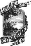
The logo looked to be a bit complex and the lack of color made it look vintage though it is no doubt that it was a wonderfully inspired idea. However, I think due to the former arguments it was changed just next year to a more modern and trendy look.
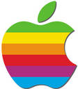
Designed by Rob Janoff, the famous bitten apple was to become Apple’s signature look for the years to come. This rainbow colored apple was designed to celebrate Newton’s discovery of gravity and the separation of light into colors of the rainbow.
The injection of color and this contemporary look was just the change that Apple needed as they moved forward in the computing industry. Some people claim that the logo was multi-colored to represent the ability of their computers to provide a colored, graphical user interface.
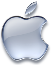
Steve Jobs, on his return to the company axed the multi-colored logo in 1997 to replace it with a more monochromatic look. This look has become the heart and soul of the Apple corporation and is consistent with their color schemes of iPads, iPods and iPhones.
Looking into the Apple Logo:
The latest monochromatic logo has held the reins at the company for around 14 years (and counting). Steve Jobs brilliantly re-designed the logo to aid with his plans for the future of the company. All the latest Apple products are in tune with the new logo as they feature a sleek and monochromatic outer casing and even a simple and professional user interface.
The use of this sleek and shiny logo also enhances the professionalism of the company and shows that it is a modern and aspiring institution that aims to invent cutting-edge products.
A monochromatic and slightly larger logo also opens up avenues for interpretation. A simple and well refined logo can be interpreted in many different ways and gives the impression of an ‘open book’ to the users. Therefore, it is unsurprising that the new logo has been lauded by customers and critics alike.
Another aspect of this logo is to provide ample flexibility to Apple and to create a brand image that would make a name for it globally. The logo doesn’t feature any wordings which is a sign of confidence that the company has in itself and that confidence has certainly paid off, as Apple is one of the most easily recognized companies in the world.
The Apple Urban Myth:
When the company launched its half bitten apple logo in 1977, many people claimed that it was a reference to the ground-breaking mathematician, Alan Turing, who had contributed immensely to the field of computers. Mr. Turing had committed suicide by consuming a cyanide laced apple and people felt that the Apple logo was a sign of respect to him.
However, logo designer Rob Janoff refuted these claims saying that he was unaware of this incident at the time and had only designed the ‘bite’ in the apple since Steve Jobs felt it resembled a cherry without the bite.
Nevertheless, legend lovers and computer fans alike, remember this reference fondly though Mr.Janoff claimed that it was simply a “wonderful urban legend”.
