Buy Everything Online on Amazon:
The world’s largest online retailer and producer of consumer electronics, Amazon serves many of the world’s biggest countries with an unbelievable range of products that can be easily purchased online.
The company was founded less than 20 years ago in 1994 by Jeff Bezos as an online bookstore. He chose the company name as Amazon because he wanted the website to appear on top in the alphabetical order and also because he wanted his site to be as large as the famous River Amazon.
The company went public in 1997 but did not turn a profit till 2001, after which it steadily grew to become one of the leading businesses worldwide. In 1999 Times Magazine named Jeff Bezos as their ‘Person of the Year’; an accolade that was well deserved because of his amazing business model.
Barnes and Noble, the largest book retailer in the U.S. filed a lawsuit against Amazon accusing of the latter’s claim to be ‘the world’s largest bookstore’ was false. The suit was later settled outside court.
Amazon has shown strong growth since the 2000s, earning 48 billion dollars in revenue at the end of last year! It is also the 10th highest ranked website in terms of traffic ranking showing why it is indeed one of the most visited sites in the world.
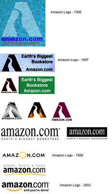
Amazon logos since its inception:
Like many websites, Amazon changed its logos pretty frequently though it has been relatively consistent with the latest addition to its logo family. Here we look at what the company logos looked like since its inception.

With 5 different logos in its entire history, not to mention the variations of its 1997 logo for various different occasions, Amazon certainly has had a rich history. Its latest logo also holds a deep symbolic meaning which is definitely worth a look.
Meaning behind the Amazon Logo:

The latest Amazon logo is more than just an emblem; it’s built on the Bezos philosophy and dream that his online store should have products ranging from A to Z. This is precisely why there is an arrow leading from the letter ‘a’ to ‘z’ in the logo.
If you peer closer, you’ll see that the bright orange arrow also forms a smile! This was meant to portray Amazon’s endeavor towards maximizing customer satisfaction and the fact that their customers would be greeted by a smile (a virtual one that is) when they logged on to the website.
The Amazon logo also uses a good, bold typeface which is neither too professional nor too casual but just strikes the perfect balance for an online store as it enables them to showcase their individuality while remaining in sync with modern trends.
The use of the color black for the logo represents the company’s superiority and dominance, something that it has repeatedly shown in the online retail industry. The bright splash of orange is also a great touch as it breaks away from the somber black to exude a bit more energy and attractiveness. The color also stands for pride and happiness, which is something that shows how Amazon works and thinks.
The ‘.com’ is also less bold to give the company name more prominence and make it stand out which is a very good advertising strategy.


